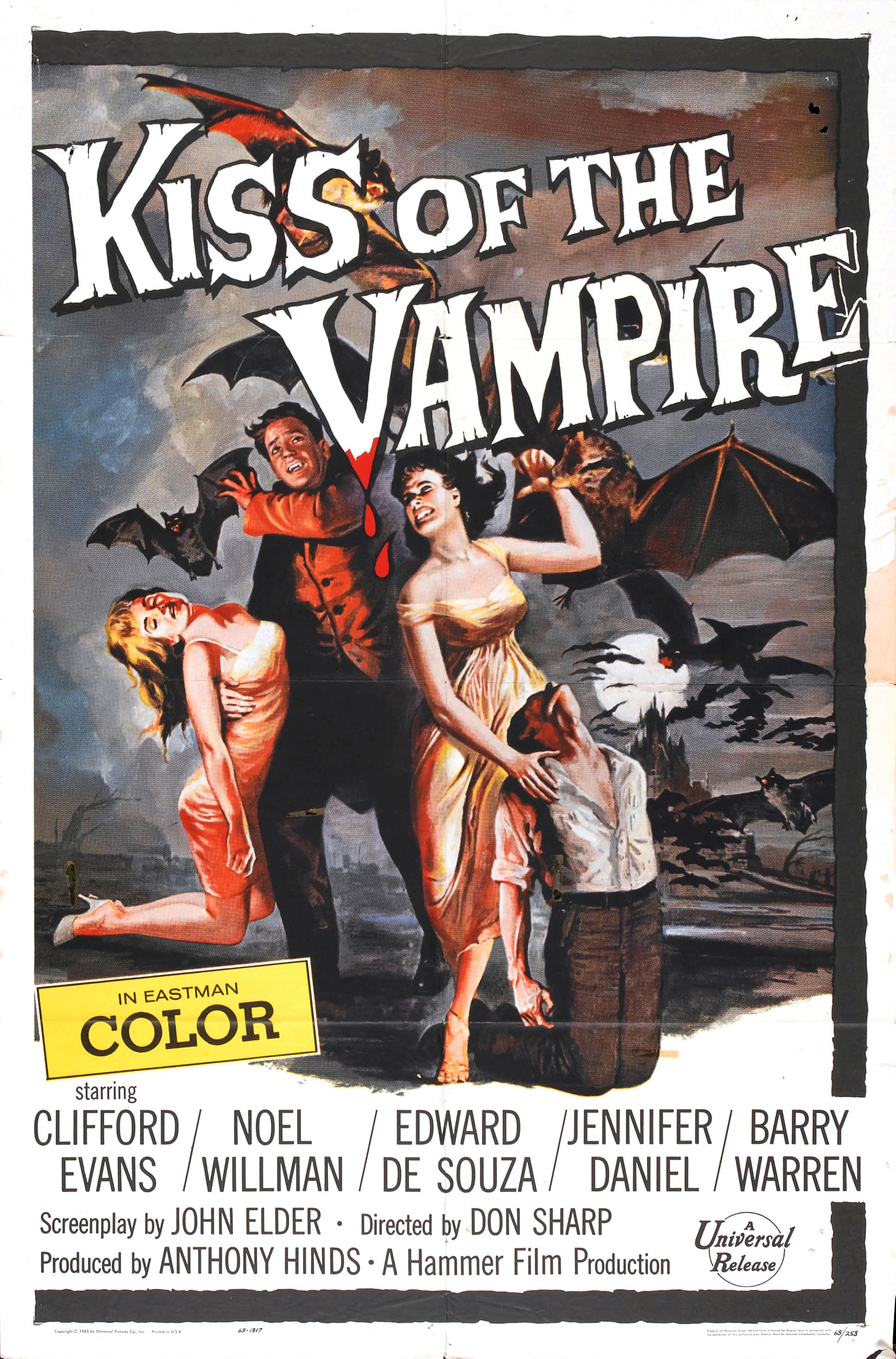
Paradigmatic Features - kiss of the vampire
- The mise on scene of the dark colour scheme communicates to the audience danger that could further imply
- The lexis of the words vampire makes it conventional of horror
- the mise on scene of the bats are highly conventional of a horror
- the red and black costume are highly connotative of horror
- The iconography of the fangs is highly conventional
- The women within the poster are not typical, displaying paradigmatic features of the women in dresses creating a romanic genre
- Generic/genre fluidity-
- Target audience for vampire films of the poster time was adults, the development of the genre now focuses on young teenage girls.
Layout and design
Composition
Images/photographs - camera shot type, angle, focus
Font size, type of font (e.g. serif/sans serif), colour
Mise-en-scène – colour, lighting, location, costume/dress, hair/make-up
Graphics, logos etc.
Language – slogan/tagline and copy
Anchorage of images and text
Elements of narrative
Kiss of the vampire (1963)
codes and conventions-
Layout and design-
composition-
images/photographs-
Font size, type of font- the font is serif creating a very grand almost antique design, this reflects the age and grand stereotypical representation of vampires.
Mise en scene- the women's clothes are not stereotypical of a horror and create a more romanticised view. The sexualisation of the women uses sex to sell the film, targeting adult straight men, creating a sexual predator out of the villains.
links to male gaze...
links to male gaze...

Comments
Post a Comment